Hue-ray for Color
Hue-ray for Color:
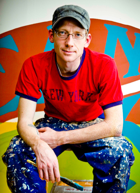
Anyone who’s stopped for a cup of joe at Bean Werks in West Asheville during the past several months has surely noticed a stark difference, not in the gourmet house-roasted blends, but the colorful walls and refreshing new ambiance. That’s thanks to Oakland, California, transplant Scott Courtenay-Smith, a guru of color and design. Since relocating his company, Renovate with Color, to Asheville last summer, he’s been painting the town. In the Lifestyle feature “Swatch Watch” in the March-April Home Issue, Courtenay-Smith offers his top picks for harmonious color palettes. Here, he offers more in-depth color and décor advice.
Q: How would you describe your design style?
I think it’s a combination of being current and cutting edge, and also making sure things have a classic quality about them.
Q: How can color impact a space?
Color is a very powerful medium. A well-chosen color palette has the ability to make a room feel like a whole new space. You’ll see this again and again, and any number of designers will agree, that the power of color to change a space without tearing anything out or building anything is pretty amazing. That’s the core premise of Renovate With Color.
Q: What are some common misconceptions people have about renovating their home?
The most common misconception I hear is that people think color is going to overpower a room and make it feel smaller. They tend to default to off-white or beige. The fact is, if the color is chosen properly it can actually make the room feel larger.
Q: What should one take into consideration when painting a room?
Look at what’s already there and what you’re considering changing. If you’re thinking of changing furniture or floor or window coverings, you should do that first. Color isn’t just what’s on the wall, it’s everything in the room, and there needs to be some sort of harmony. It’s amazing what can happen when you put one color next to another. Take a certain blue and put it next to a yellow, then take that same blue and put it next to a green; you’re brain will actually see the blue as different colors.
Q: How can homeowners make a room feel more dynamic?
Try using complementary colors or colors that are opposite each other on the color wheel [yellow and purple, blue and orange, red and green]. Those color combos can make a room feel edgy and alive. I also play a lot with split complementary palettes, which utilize those colors a step to the left or right of the actual complementary color, such as green with bluish red and orange-y red. This can be less edgy, but still dynamic.
Learn more about Courtenay-Smith and check out his design blog at www.renovatewithcolor.com.